I would love to have you guys as involved in this process as possible. �With that said, I would love to get your thoughts on 3 Possible Book Covers for my new book: “Choose Your Own Money-Saving Adventure”.
Just remember that these are ROUGH drafts. �But I wanted to get your opinions or choice before I move forward with picking a cover and making it just right!
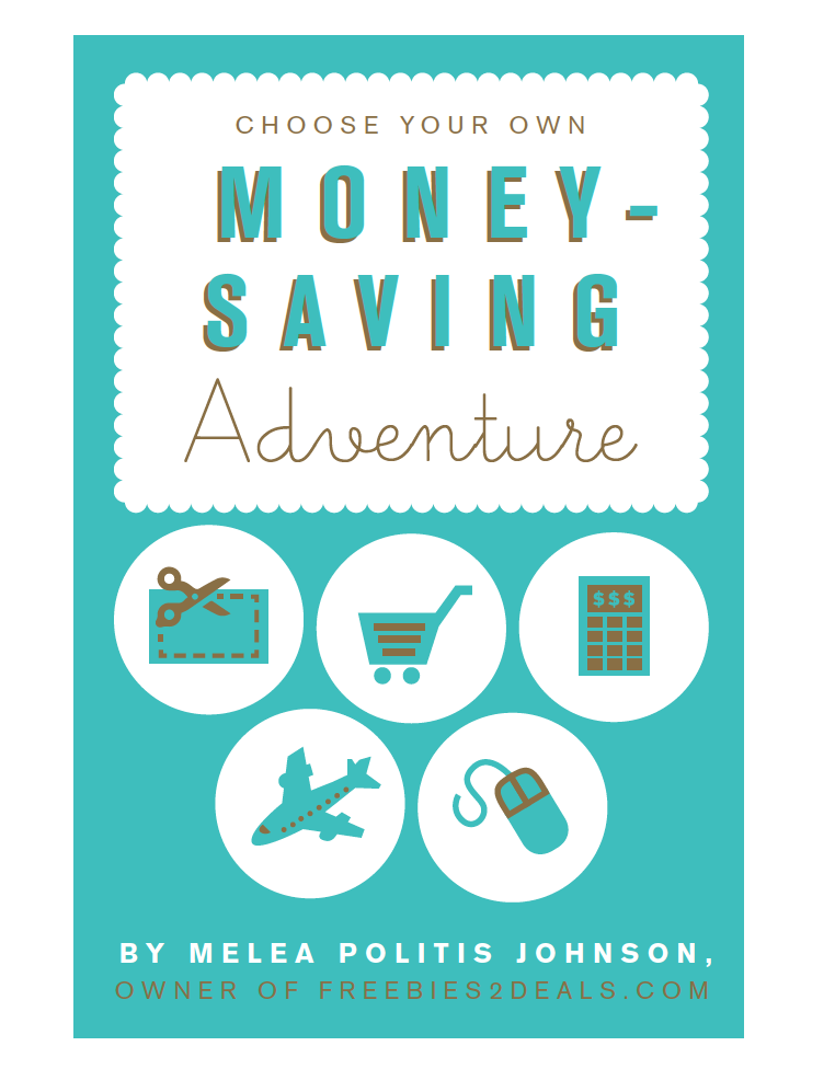
Option #1:
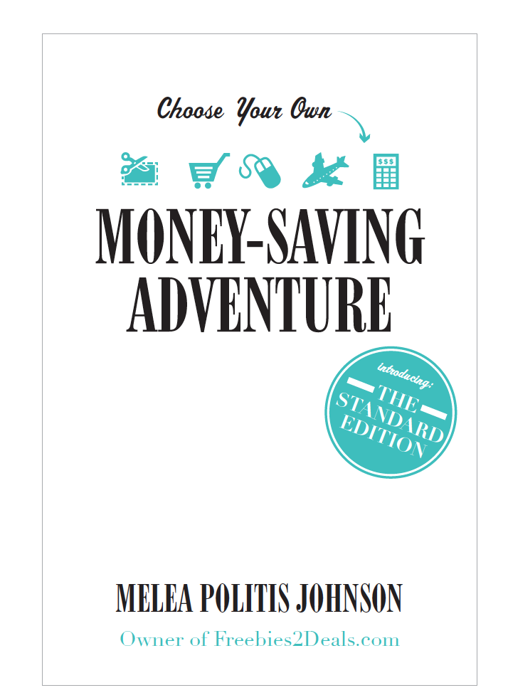
Option #2:
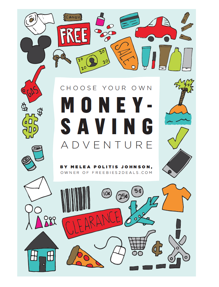
Option #3:
Ok so there you have it! �Do you like one more than the others? �What book would catch your attention if you saw it on a shelf? �This book isn’t just about couponing- like a lot of other books I have seen out there. �It is about all aspects of saving money. So, keep that in mind too!
Just leave a comment below with what you think, and your choice! �(If you are reading this in your RSS Feed, or email, just head here to comment directly) �Thanks for your help!
Leesa
I like option 3! I think the colors are eye catching and would catch my attention on the shelf!
Tiann
I agree, #3 is the best. It really stands out as to how many things you can save on.
alisa
I like #3 also
suzette
book cover 1
Jenny G.
The 3rd one is the most eye-catching, but the first one is the cutest. Ditch the 2nd one for sure, it’s a snooze. 🙂 Congratulations and good luck!
carmen
Seems like a lot of people like 1 AND 3…why not a combination? :)…
My suggestion: ditch the scallops in #1 and keep the clean-looking circles, but COLORIZE them and make them more random (large and small) like in #3.
Nikki
I second Carmen’s suggestion!
Tara
I love 1!!!!!!
Sami Knell
I like option 1, but I think option 3 will grab people’s attention! 🙂 Congrats on the book!
Jennifer
1, not 2, maybe 3
Lili
Option 3 makes it seem like fun
Julie Buttars
Option 3 That would catch my attention.
Christina Carrick
I like the first the best! It’s got that retro vibe that’s really in right now. 🙂
SueAnn
I like #1!
K Carter
One.
farrah
#3 . I like all the little icons about what you can save money on.
Michelle Dewhurst
#1 is my favorite only because it looks like setting I would grab to review/buy. Number 2 is way too plain and #3 would catch my eye but is very busy and I am not sure if it would really make me grab it or just be too busy? I looked at all my books I own and none have that much going on…
Taylor
Love #3!
Jacinta
One!
melissa giraldi
first one
Julia
#1, so cute!
mary beck
option 1 would catch my attention the most
Linda Walker
If I was out shopping the 3rd option would catch my eye and I would be interested in picking it up and looking at it. It has color and looks fun!!! Good Luck
Mollee
#1. It’s cute and modern. I would pick it up off the shelf.
Sarah T.
Definitely not #2.
I like #1 and #3, #3 is my favorite though!
Congratulations by the way! 😉
Rosanna
Probably #1, but 3 is a close second! Way to go!
Kristy DeMercy
Love #3.. Caught my eye because of all the different pics… Made me think that I could save money on all these different things.
Julie Denson
I like 3 – I think it looks like a fun book and is the most eye catching for sure. the other two look boring and I know you are NOT boring at all! You are super fun!
Jessica
I like 2 because it looks like a book anyone would read.
Cindy
Number 3. The other options are to bland.
Kellie Anderson
I think #1 is ok, #2 is my least favorite, and #3 would be one that if I saw in the bookstore, I’d pick it up and look through it. #3 is the most eye-catching I think, and gives a better idea – just by looking at the cover – what kinds of things are in the book. 🙂
Adrianne
Love #3
Heather
#2!
Amanda
I love the classy look of the first option, but I think the third one is the most eye catching and is the most relevant for the topic of the book.
Karla
#3 is definitely the most eye catching, and the images used clearly articulate that this book will help save $ in every facet of living. If I had to choose a 2nd option, it would be #1.
Amy Cote
#1 for sure. While #3 has a lot of different icons I think there is too much going on. 🙂
Brittanie Pyper
I personally like the second one. I think it looks more professional. However, I also like option #1 because of the bright blue color, it would certainly be eye catching.
Cari
I love #3, but I think it might look a little too 1990’s (it looks like every-other money saving book you can find in the DI).
I think #2 looks the most professional, but I think #1 matches your website artwork the best.
Jaqueline Knicos
One 🙂
Lana
I like #1 and #3. #2 is kinda boring and sparse-looking.
Mary
I like 1 and 3…I think 3 would be the most eye catching though.
Brandy L
I like 1
Megan
I like option #3, it caught my eye and I liked seeing the different depictions of things discussed in the book. #2 is my second favorite, I like the clean and classy look.
Heather D.
Hands down option #3
Brittany Rowett
Option 1!
Emily
#1
Rachel
Number 3
Kim Black
#1 is my pick. I would like #3 if it wasn’t quite so busy. Blessing to you on your book adventure.
Kim
Shannon Hunter
#3 FOR SURE!!!! I like #1, it’s cute, but it wouldn’t catch my eye at all.
shannon
#1 & 3 are my choices. #1 because I absolutely adore that shade of blue and #3 because of all the cute pictures 🙂
Carrie
I definitely like Option #1 the best. They’re all good-looking book covers but it jumps out to me as looking the most modern and fresh. You can tell right away that it’s a brand new title and looks simple and clean, which is what I think your readers will probably be looking for.
Mallory
I think #1 is cute but looks homemade. #2 is boring. I think I would go with #3.
Chelsea
My favorite is 3, then 1. Two isn’t jazzy enough for me! I know people said #3 is a little busy, but it’s supposed to be a fun read with good tips on saving money, so you aren’t going for a Harvard look. It’s a book anyone should feel comfortable picking up and reading.
Lori Stevens
My favorite is #3, hands down!
Adrienne hoerler
Option 1 is the BEST!! Option 2 too plain boring. But option 3 too busy doesnt look like a book instead like a coupon book.
Emily
I like option 3 the best but #1 is really nice too.
Whitney
I like #1 the best! It is by far the cutest and looks clean and simple! Something in would definitely want to pick up! #3 looks a little too busy and reminds me more if a children’s book with all the cartoon icons!
Becky
Number one for sure. It’s trendy and looks like a fresh and understandable read. Number three is very busy and all the pictures distract from the title and author 😉
Ann
I really like option #3!!! It’s so cute and caught my eye immediately. Option #1 is my second choice!
Laura Hayes
#1! #3 is nice, but a little too busy – you miss the title!
Daisy
I vote #1
Marcie
I’d have to say #3 — it caught my attention more than the other choices. Second choice would be $1, third would be #2.
Ryan
LOVE option 3
Kayla Reitz
I PICK #1
Emily
#1 for sure!
Stephanie
I like 2 and 3 fairly evenly, but think 1 looks a little dated. I wouldn’t likely pick it up blindly.
Coylette
I like #1 too. I like the play on the “Choose Your Own Adventure” books that I LOVED growing up. That being said, I personally like how “Money-Saving” and “Adventure” are in different fonts in #1 and that “Adventure” is very similar to the font for “Choose Your Own”. Plus I think #3 is a bit too overwhelming.
Hopefully my explanation makes sense and I didn’t just confuse ya! Good luck…great job!
Guka_F
I like no1. I think no3 looks like a kids book. Anyways, good luck with it:)
becky
I like 1 and 3.
Shila
I would buy book #1 off the shelf, it’s bold and stands out. Though #3 is fun and cute but it’s leans towards childish looking and busy, almost confusing. To save money a person needs a little organization. Option #2 has a good layout but doesn’t have enough umph, maybe use a hot pink or sunshine yellow background instead of white. Just my two cents, GOOD LUCK!
Karolyn
Option 3. It’s colorful and draws your attention. Stands out from the others.
Karen
I like Option 3. All the little icons capture my attention and I think it illustrates the many different areas I can save money.
Krista Harrison
I like the first one. It’s not too cluttered like the last one. It’s more bold than the second. I like the simplicity of the first one. Congratulations on writing a book!
AMy
I like #1 and #2
Lisa
I like #3 then #1. Congratulations! 🙂
Stacey
I like #1. #2 isn’t quite as eye catching and #3 is a little too overwhelming for me. Looks kind of chaotic.
Tiffany Candelaria
I like 1 its modern and trendy. 3 is ok its a little busy….
linsey
I like #1 the best. Not as cluttered at #3.
Cristal
option one is easier to read and understand what you are trying to say
Taryn Prazen
#3 for sure, then #1. Congrats on the book! That is so exciting!
Hanna
#1!
Cara
#1
amber
Option 3
Vicky Mathis
I love #3 🙂
Erika
#3
Paul
Option 3 – the colors are eye-catching, followed by option 1 – clean design. I am not a fan of option 2.
Eric
I like #3
Jessica
#1 is my favorite! #3 is fun but a little busy for my liking!
Marci
#3
Vickie Madewell
I like #3 the best.
Jackquelyn
#1
Lori
Number#3
Juliana
#1 for sure!!!
Heidi
I think if you had some of the colors of number 3 with the look of number 1 it would be perfect.
Diane Murdock
#1
Joanna
Option 1 has a clean, appealing design and good color balance. Option 2 has an empty feel to it that may not be very eye-catching on a shelf. Option 3 is eye-catching but honestly, if I glanced at it in a store, I would think it’s geared towards kids because of the kid drawn icons. Remember, people will glance at it and make a judgement if they are interested or not in about 3 seconds.
Brenda Lion
I would pick book number 2 off of the shelve to view. I think white book cover with teal print. Book number 3 is too busy. Good luck with your book sales. Love the website use it daily for great deals and of course the freebies.
Leigh H
#3 🙂
Shara
I’m split between 1 & 3, I like that “free” is on 3, Free always catches the eye 🙂 Congratulations, and great job!
Valerie Parris
I like option 1. The second one is too plain. the 3rd one is too cluttered. The first one is simple and is very clear. It tells you what its about, and has a few pics for character. I Like it 🙂
Michelle P
#1 For sure. 3 is too cluttered and busy, but cute.
Teresa
I love #1 the most, and if it the icons were a different color I think it would stand out more.. Good Luck
jill
3 definitely!
Annalese
#1- Classy yet catchy but not too overwhelming!
Ashley Oakley
I like #3. I like how it gives a preview of what you go over ( using pictures ) without using any words
peggy
1 and 3
michelle
#3
Kathy
I really like #1 but I do think #3 is more eye catching.
Julie
I like # 1, but maybe make the icons a different color, all the same color but different from the other colors on the cover, or maybe the title a different color so it stands out more. #2 is boring and doesn’t have anything to make me want to grab it and #3 is just too busy and actually makes me think it is a book for children. Like a look and find book or something.
Tayler
I like #1 the most
Heidi
1 or 2!
Tasha
I vote option #1…..1st choice
#3……2nd choice
Melissa
One could use a little bit more interesting animation, more color on the pictures maybe, or highlight a bar across the bottom with your name in it, with some color.. Two is a no go for sure, I would pass it up, because it looks boring and uninteresting. Three catches the eye, but also seems really youthful, may want to tone it down a bit. (take out some of the pictures and leave more space in between picts. Or tone down the colors so there is less going on.) I’m tied between 1 and 3. But overall good work, I’m sure its hard to set up a book and the cover is Daunting, as it is what draws the reader in. Good luck and congrats!
Jo Romero
I don’t like #1
I like #2 the best
but wished it had a little of #3
so I would like to see #2 with a little more fun to it 😉 good luck!
Shanna J
From a graphic designer standpoint, I vote option 1 for sure. #3 is cute and fun looking, but makes me feel like its just going to complicate my life, which is not what most people looking for help saving money are after. #1 gets across the point, looks sharp, but most importantly looks clean and simple and makes me feel like the advice inside might be the same way 🙂 Good luck! I think this is a great idea and I’m so excited for you!
Sara
I like #1 — the title stands out most on that one, but I would reconsider some of the icons. They seem too similar if you’re focusing on more than just couponing. I think #3 conveys the subject best but the title gets lost and it could get too busy in a sea of other books on a shelf.
Kailey Larsen
#1 is awesome!! Yay! Congrats
LSW
#1 and #3 are pretty on par with what is out there already as far as money-saving books. I like the look of #2 and I know that’s not the most popular vote so far. Let me tell you why.
1. it’s clean and you can read the words without clutter of other “things”
2. With all the other books that have a bazillion colors/items/words on the cover, this would catch my eye because it’s so different than most of the other covers out there right now.
3. If you want people to look at a book about saving money, it needs to look more than just a mom-blogger (no offense) who is good at what she does. It needs to look professional and like the author knows what they’re talking about without all the frilly stuff on cover #1 and the clutter on #3.
There’s my opinion. Most of you will disagree but it’s ok to agree to disagree. Good luck on whatever cover you end up choosing!
Melissa
I would change the white sections to another color.Yellow would look great with book one, or lime green, it would pop and catch the eye. ~ my interior designing majoring, opinion 🙂
JOLENE
I LOVE OPTION 2!
Fantastic and congratulations!
Jamie
#3 or #1; 2 doesn’t really catch my attention. Congrats on your book, that’s awesome!
Charity
#3
kim
I like #1
Jeremy
Option 3.
Christa Warren
#3..more appealing cover…better sales.
Daniele
#3 Oh my goodness I LOVE number 3!!
Jennifer Taylor
I love number 1. It is cute, eye catching, but simple. I think #3 is too busy and I get lost. #2 the pictures are too small and don’t jump out at me. #1 is easy to know what the book will be about with the 5 pictures you have chosen. I love the color and it pops out to me.
caryn
I like number 1 best- except for the scalloped edges around the main box, #3 is my second choice.
Stacey
#1 or #3. I like #3 most
Kristin
#1. It’s cute!!!! Classic!! But #3 is cute…. 🙂
Heather McKee
I like #3
Wendy
#1 for sure, it has a bit of sophistication and seriousness. #2, hmm, too much white and font is distracting and hard to read. #3 the color catches your eye, but once I got a closer look, I would pass as it’s too busy and the doodles makes me not really take it seriously. Just my opinion.
Rachel
Option #1
David
Option 1 looks fun and professional. Option 3 I would look past it.
Corina
I really like the clean look of #1.
Nancy Hamilton
I like option 1 the best. To me option 2 is to simple and option 3 looks like there is to much to it.
Londi
Option 1 if you’re going for a more “professional” look and option three if you are going for a more “fun” and “casuaul” look.
Liliana Arredondo
Option #1. Waaaay cute. 🙂
Kendra Pierce
#3! It has a more appealing look to it. #1 is very professional but I tend to judge a book by its cover. If #1 and 3 were sitting side by side in a book store from different authors I would buy #3
Mel
#1 is the best! #2 is too plain and #3 is too busy. #1 makes me want to choose one of the icons to get a discount, while 3 just overloads me.
Haylee Gamble
I like both number 1 and 3. 1 is a bit more simple and clean, seems very organized which is a point that would go along well with your book in my opinion. I also like number 3 because it grabs your attention with all of the icons, but it seems a little bit busy. Both are really good options tho!! Congrats Melea!!
Kassi
I like option #1
Jennifer
3
Nichole
I by far choose 3 over the others. #1 is clean and fancy but won’t catch the attention of passerby’s as much as #3. #2 is blah.
Trinady
#1 For sure! By far the best looking!
Mandi G.
I like #1 the best! I like the color in #3, but there’s too much going on for me.
April
Cover #1
Susan Pearson
#3 Is the most eye catching, I also like #1 but it would need more color…I would use the color green that you have on your website. #3 is my favorite though. 🙂
kaylin
3
Amy
I agree with Mandi G. I like option #1 the best. Too much going on in #3
Naomi Morrill
1!
Kira
#1
Alesha
3
Rachael
I love #1 the best!
Bethany
I like 1 the best. 2 is a little plain and 3 is to chaotic.
Becca H.
Option #1 – by far the best!
rosanne
1 is traditional looking or 3 is fun. I Like both
Jenny
Option #1 – color is catching, but not too busy. #2 is blah. #3 is too busy.
Rachael
I absolutely LOVE #3! If I were to see it on the shelf, I would be much more likely to pick it up because of the colors!
Nicole
Option 1 is my favorite, caught my eye right away. I also like option 3.
Chelsea
#3 is the most eye catching
sarah
1 or 3
Candice M
I like number #1…number three looks too busy
melanie riley
number 3
Jennifer J
THREE! Definitely the most eye catching.
Cxia
Option 3 is very eye catching and interesting!
chelsee
I like number one. I feel like three is a little too cluttered. It is eye catching though. Two is too bland, definitely get rid of that one 🙂
Nicole
I like #1
June
Option 3 is great with a variety of elements and colors that are cohesive!
Cheryl torrente
Option 1 is simple but classy. Neat but concise. Luv d color too. Catchy yet uncluttered
Heather
#1 is my favorite!
Lisa
I like #1.
Julie
#3 grabbed my attention.
Emily
I love #1
KoriAnn
I love option #1
Jamie
Number 3 is eye catching and a want to know more cover. Number 1 has better color options than 2, but it looks like a girly scrapbook focus that might leave other readers from wanting to take a look. Number 2 is clean looking but more of a textbook look that might non be a pick me up and thumb through me option. 3is my choice with 2 as a second
Kayla
I’m torn between option 2 & option 3! option 2 is nice and simple-but #3 does catch your eye!
Taryn
#3 would catch my eye the best but #1 is the cutest.
#1 would not stand out to me if I walked past it in a book store though.
#2 looks boring and a little to plain.
Ashley
I like 3!
Jackie
#1! For sure!
J
I like #3. #1 is pretty, but at first glance looks like it would be a cookbook or something similar, that I would pass over as I was looking around at a bookstore. I see what others mean about #3 being cluttered, but for me the fact that there is SO MUCH to see would be the reason I actually pick it up and look at it. Congratulations!!
Renee
#3
Whitney Nielson
#1!!
Kristi
#1 for sure!!!
Nicole
I like 1 and 2 for a cleaner look. But they are all great.
Erin
#3
Meg
I like #1 then #3. 🙂
Linda
In order of preference: 3, 2, then 1.
Yuri
#1 is more appealing to me. It looks a little more sophisticated than #2 or #3 to me….! Good luck with your book!
lacy hilton
#1 is my favorite! I also like #3 but it does look more like a kids book to me.
Amber
Option 3 for sure. The others are cute but wouldn’t catch my attention. The third gets my interest and gives a better overview of the variety of content included.
Heidi V
3 is the most eye catching for sure. I also like 1 because it looks more sophisticated but I’m not sure it would grab my attention in a bookstore.
Marchelle
One, Uno, Einz, Un 🙂
Keola Kinghorn
I like #1 the best! Two is a close second!
Linds
Out of the three, #1 is the only one I’d pick up and want to buy without knowing any other info. Love #1!!!
Amy
I like #1
Erica
I like 1 and 3… this is so exciting! 🙂
Kaylee
Option #1. It is clean and easy to read and eye catching. The second one is too plain and the third one is too busy .
Stephanie
Option 3!
Erin webster
I love number two. Simple and to the point. “Money saving adventure” really stands out.
It’s not over powered with pictures like the other two.
Momsy
I like #3 because it is very eye catching and has bright colors.
But, #1 looks more like your website and I would associate the two things as being from the same person/website. They are more cohesive.
#2 is ok
Eridqua
I like option #1. I feel that option #3 is too cluttered.
Heather Berrett
Number 1 for sure. 3 is cute but it kind of looks like a kids book in my opinion.
Lina
#1 with maybe a bit more color 🙂
abby
1 caught my eye, I do like 3, but it almost looks like a kids book. Maybe if you could take a few of those and add them to 1. 1 just looks classy to me.
Kristy
I would go with number 1…2 isn’t very catchy. The 3rd one I agree with some other people…way too busy looking. The bright colors are nice, but too many icons and I’d be overwhelmed as well. You would need the title to stand out more…it gets swallowed up in the pictures…..
Brandy
option #1
Krista Bell
Option #3
Angelena
#1 looks great. Congrats
Cami
#1
Heather
Option #3
cynthia
#3
Faith
Two I would pick up and look at, one is cute and might catch my attention, three I would avoid- it looks annoying.
Erika
I like option #1
Lauren
Number One! Definitely!
Anthony
#1 is the most appealing in my opinion!
Michelle
#1 hands down 🙂
Darci Thorsted
#1 for sure! 2 is too plain and 3 is way to cluttered, I wouldn’t even want to pick the book up, it stresses me out!
Kyra
#1 all the way!
Lisa
#3 has eye-catching color and seems like something the typical mom (majority population who is looking into saving money on things they’d buy for the family) would find interesting.
Rachelle
I like #3. I wouldn’t even notice #1 or #2 if they were on the shelf. Honestly–I’d just walk right on past both of them. I know that #1 looks more “modern” for the time being; but, I think it would look really dated in just a few years. #3 looks more classic.
Angela Pedersen
I like #1 the best!
Dawnie Fretwell
1 or 3
Linsi
#1 is the most aesthetically pleasing in my opinion.
Kim
#2
Dorie
#1 or #3 but leaning towards #3 a little more! Cute designs!
Barbara
#1
Linda
#3 would definitely catch my eye.
Stacy
#1. Congratulations!
Kelly H
#1 or possibly #3, not #2. I like the idea of the little graphics/icons on #3, but it’s too cluttered –makes it look cheaper and more juvenile than the message you want to send.
sherrie
definitely option 3. the bright colors make it pop and i love all the custom illustrations.
Melissa
I think it may depend greatly upon the customers personality, I would go with what matches YOUR Personality and the Personality/Feeling of the book, to attract those who are most like you. Because those who are most like you will most likely enjoy your book more than others.
Jocelyn
#2 is way to boring/plain, #3 is the most eye catching but I don’t think I would buy it, #1 has the best design but it would be more eye catching and say buy me if it was in a brighter color like Orange.
Good luck with the book can’t wait to see it!
Krista
#3
Lori
#1 is my favorite – the words money-saving really stand out. #2 is too plain-so if you chose a background other than white, maybe. #3 has too much doing on and looks childish. Good luck.
Jamie Morrison
I like option 1 the best!
Janan Grange
Option 1. Don’t like 2 and 3 is too busy
mariana S.
#1
Congratulations and best of luck 🙂
Jodie Pierce
I like 3 the best. It’s the most fun:)
Amy
I like #1. Seems more modern/different.
amber allen
3 is the most eye catching, but I like 1
Aubrey
I like #1 and #3 for different reasons. #3 seems like it would be organized like an encyclopedia or something, while #1 looks like it would read more like a novel. #1 is more classy while #3 is more fun. I think they would both appeal to different personality types.
Crystal Bodily
#1
Lindy Robinson
#3 the colors stand out
Christie
My favorite is #1! It is classy and eye-catching! Good luck!
Mellissia
I like #1 I feel like it is the most professional and most attention drawing.
Alyssa bassett
#1!
Sarah Carpenter
I like #3 it is the most eye catching and fun! Congrats!!
Chrystal Thompson
I like Option #1.
Jessica
Option 1 and then 3, but not 2.
Kristy
Option 1 looks interesting–but Option 3 looks fun! I would look right over Option 2 if I saw it on a shelf!
Ashley
Option 1
Shan
Option 3. 1 is cute too but not 2.
Renee
#1 is my favorite.
Emily Davies
Option #1!!!
Shanna
#3 is fun and gets your attention, but I also like the clean look of #1. #2 does nothing for my interest.
Ros Yuliane
Congratz!
I like the 3rd one most.
And thank you for all of your hard works for us!
Callie
#1 definitely!
Wendy
Definitely 3!! Good Luck and can’t wait!
Celeste
3 but I also like 1. I don’t think you can go wrong with either one.
Dolores
I like #3 because of the pictures you put, it shows pretty much a little bit of everything that someone can save on.
Toni
Option 1 or 3 are my picks. Option 1 is easy to read and to the point. However, Option #3 would catch my attention more if it was on the bookshelf unless like another person commented, it was surrounded by other books with similar covers.
Amy
I like option #1 the best!
Jamie
Option 1~~!!!!!!
Kimberly
I love 3. All of the colors pop out, and it’s one of those covers where, if you glanced at it from across the room, you’d instantly recognize it. Plus, it’s fun to look at. (I really love you title, by the way!)
m simmons
# 3!
Heather
I like number 1 the best but number 3 would catch my eye more.
Krista T
Definitely #3! It really grabs my attention and the little pictures do a great job of showing what a wide variety of things you can save money on.
Tina
Option #1. It looks the most legit. Option #3 is just too busy.
Jacquie Z`
I like # 3 , it’s the most eye catching. I think it would stand out more.
Carolyn Kuntz
Option 3 is very eye catching
Beth
Option #1 !!
Brittany
Either option #1 or #3!
Aubree
#3 is my number one – #1 is my second
Can’t wait to buy it!!
Jamie
I like #1 the best but #3 would probably be more attention catching. 🙂 Congrats!
James
Option 2
Stacie
I like option 1 or 2.
Riana
Number 1
Kara
Definitely #3. It’s the most eye-catching. With all the pictures on the cover it shows more of what’s included in your money-saving adventure.
Analise
Option #1 is the one that would catch my eye, hands down. Congratulations!!
Cheyenne
Love #2 — very professional and classy, also simple.
Aimee
#3! Fun and cute, great theme for family vacations.
Dena
Option one for sure!!!
John
Could go with either:
#1 – Classy & too the point
#3 – Eye catching
Michelle
I like #3. 🙂
Julie
Option 1 and 3
Courtney
I like #1. #3 is a great design and does catch your eye (I love that you’ve included a Mickey head on there), but the colors kind of clash in my opinion. The first one looks a lot more professional.
Minnie
#3 is the one! The cover is visually interesting!
Kathryn
#3
Danna
I like the first option!
Sheila
I like 1, the title is bolder. The icons could be jazzed a little. Everyone is right, 2 is a snooze. 3 is nice, but too busy, the title is lost in the confusion.
Kyrstin
#1 is definitely my favorite but if you’re going for eye catching than go with option #3!
Carmen Hughes
I like #1. It’s the most aesthetically pleasing!!
Teresa
#1
Nancy B.
#3 is my favorite – just make it a little less “busy”. #2 is boring. #1 is my 2nd favorite but needs a brighter color.
Jill
I agree with most of the others. Option 1 is very nice and classy, Option 3 is eye-catching, colorful, and very appealing. Option 2 is a snoozer! Ditch it! 🙂
Rusty
1 or 3
Nanette
I like #3
Carol
One and three are my favs
Becky
I like option #3. It’s colorful and interesting because of all the pictures. Good luck with the new book.
June
Get rid of the second one. Boring! I like the third one, but it needs to calm down just a little, I think it is a bit too crowded.
Sarah Cleveland
I like 3 the best, but it could be considered to be a little busy. Number 1 would be my next choice. Don’t go with number 2
Kania
I like the layout of #1 but it would look better with more color like #3.
Angela Paulsen
#1 is classy-cute
Donna Snyder
I like all the color of #3 but my choice would be #1
McKensie Bingham
I love #1
Caitlin
I love #1 – great colors and simple, #2 is nice and to the point but it doesn’t really show your personality, and #3 is cute but I find all the pictures to kind of distract me from the title. Good luck and congrats on the book!!
Adrienne Hansen
Love #1, very trendy looking and clean
Andrea
Option #3 catches your eye more with the different colors and especially with red as one of them! 🙂 It’s bright and busy and cute! 🙂
Calie
#1 for sure
Cammy Rigby
Option one because it’s cute, bright and not busy!
Bobbi Davis
I love #1. Love the colors
Jane
I like option 3!
Karen Hansen
I like #1. I think #3 is a little too busy. My eye would really look at #1.
Ruth D
Option #3 by a landslide. It’s eye catching and expresses you so well! The other 2 are blah and look like every other “how to” book on the market.
Melanie F
3 is tooooo busy! 2 is boring. 1 is the best of the 3, but you might consider using that layout with more color.
Allyn
I like #3, I love the colors. It totally catches my eye.
Rebecca
From a graphic design standpoint, I think Option 1 is laid out the best and is the most cohesive in its design. Option 2’s design seems to lean more towards a serious accounting book, rather than a fun and helpful way to save money. And Option 3 is far too busy in its design – too many competing elements.
I’m excited to read your book!
Britta H.
I like 1 the best!!!!
MOlly
Option 1 for sure! Classy and Cute. I’d pick it up 😉
Heather Jensen
#1 for sure. It’s classy and will appeal to your target audience…moms! It’s also more eye catching, not too cluttered. Good luck!
Penny
Option 1 is my favorite! I love it! I feel option 2 is boring and option 3 is to busy and distracting. Good luck with your decision! I can’t wait to read it!
Stacey
I like #1. #2 is a yawn & #3 is too busy.
Trish
I like #3
SARAH TURNEY
Option 1!
emilie
I like the option 1 the best! Loving the color & there isnt too much drawing which made it clear & attractive.
Sarah
1 or 3. I think #3 catches your attention more. Good luck!
Katie
#3!!
Denise
#3
Tami
I love option #3! I like the colors, it would make me want to pick it up…much more interesting!
michelle
I like option 3.
Kathleen
Definitely #3! It caught my eye right away, and it looks like it would be a fun (and informative) book to read!
Kari
#1 is definitely the cutest! I love the look of it.
#3 is good in that it shows a lot of different ideas (Disney, gas, toilet paper, etc.) but I think it looks really chintzy.
I know they say you can’t judge a book by its cover, but we all know that everyone does it. The first cover looks much more presentable and professional, not like #3 where some non-expert just threw a bunch of clip art into a jumble. I don’t want to sound mean, I just want to give an honest opinion. 🙂
Jessie
#1 all the way.
Jessika
DEFINITELY option 1! Like others have been saying option 2 is a little too plain and option 3 is too busy. Maybe if you added a little color to option 2 and changed the font of the serif font that the title/your name are in (it’s too tall/blocky looking and the look of it doesn’t fit the context of the book). You could also add a banner or some graphic like that around the “money-saving adventure” part of the title to make it look a little more adventure-y, lol. I like the idea of option 3, but maybe just have those pictures on the top/bottom instead of all over?
Julie Frank
Option 1 for sure!!
Erin Morrow
Option 1 is my first choice and Option 3 is my second choice. 🙂
Jessica
I like #1 and #3. The third option probably suits your target audience more than the others. Congrats and good luck!!! 🙂
Vero
Option #3
Kirstin
#3!
Rachel
#1! Congrats! How exciting. 🙂
jenny
#1…..absolutely.
Courtney
Option #1
Adriann
option 1 for sure!
Beverly Romanelli
I have to say it is #3 for me. Love the colorful pictures, they get your attention!
Terri
#3 – most colorful!
Melanie
#1 is my favorite.
ralph jolly
#3
Ashley Bustamante
In my opinion, #3 looks the most like a professional book cover. #1 matches your blog, though, so if you want a brand connection, I’d do that one.
Melissa Hartley
Option #3 is my favorite! 🙂
Tiffany
#1 is my favorite!
Adrienne Ballantyne
I like option #1 the best.
Travis
Option #1 is my favorite because it is more professional but I do like #3 too, it is just more kid and fun like! Still my Option is #1.
Annie
I like #3. It is colorful and fun just like your posts!! Thanks
Melissa
I think the title needs to be a bit more catchy/have impact. I like #1 because it is classic; I like the idea of #3 but would go with more classy/authentic look styling. The color on#3 is nice but almost too whimsical/child like. It makes it hard to resonate with understanding the intent/purpose of the book.
Maybe add a tag line to better explain the book?
Kellie Dickes
Option 1 I think works best with the title. Simple and Bold!
Karen Whiting
#1 is eye catching and classy. #2 is too plain and #3 is way too busy!
Amber Smith
Number one for sure!!
Melissa
3
Erika
Option #1. Nice clean. I would trust that cover!
Jen
#1 I like books with “cute” covers, but I would change the Money Saving font
Eric
#3
Shanna
Option 1
Susan
#3
Allie
I like #1 the best. I think #3 is cute, but it might look a bit like it’s marketed for children instead of adults.
Melissa Copfer
I am torn between #1 & #3. I like the simple elegant look of #1. But I also enjoy the fun exciting look of #3.
Crystal
Definitely #1, I can see it on the New York Times Best Sellers Rack!
Amie
I like 3 the best! It’s so colorful and attention-getting!
Karen
I like both 1 and 3. #3 is probably more eye-catching while #1 has a more mature, clean look without being boring.
Craig
#1 looks like it reflects what you are trying to get across. Good Luck!!
Michelle B
I like #1. It is cute and creative, but not too over the top. I think #2 is a little plain, but it looks nice. Number 3 is too busy. I like the colors, but I think it is too much. Maybe tone it down and I think it would be better.
Jamie V.
In order, #3, 1, then 2. 3 is the most eye-catching and colorful.
Kristie
I like #3 as well! I like the colors, and the little icons go along with adventure!!
Natalie darger
Since the word “adventure” is in the title, it seems like it should be an adventurous cover. Number three or number one, number two does not look like an adventure at all.
Beth Hoffer
#1 for sure. I really like the retro look of #1 and it’s a calming, pleasing-to-the-eye look that gives proper size and attention to the title. I think that #2 is just too plain and #3, though colorful, is too busy and gives off a stressful vibe and you don’t want the reader to get the impression that trying these tips to save money is too stressful for their already busy lives.
Atenea
I love #2 I love the appearance and I think it appeals more to me!
Stephanie
I really like #1!
Ashley
#1 for sure! 3 is eye catching, but too busy and juvenile. 1 is more classic and sophisticated.
Elizabeth Makhobey
I would choose Option#3 its fun colorful and informative. Will catch readers eye!
Mary Ellen Larkin
I like Option #1. It’s cleaner and not so busy as option 3. Option 1 is more professional and not so juvenile.
Kathy Kimball
I like the first one. The second is boring, and the third looks too cartoon-y (I know, not a word 🙂 Good luck and Congrats!
Rebecca
I like #1! It stands out to me the most because of the style. #3 has a lot of color, making it stand out too, but I think there is too much on it! #1 is sleek and simple but still stands out!
Aimee Sommer
I like 1! I think 2 isn’t eye catching enough and 3 is to busy!
MC
Option 3. It seems to fit the personality of your blog the most. The first seems a bit bland, the second is nice but doesn’t fit, the third seems also the most timeless – the first two will “expire” in a year or so…
Teresa O.
Congrats on your book! 1st choice is #3 cover because it is whimsical and fun. 2nd choice is #1 cover because it is bold and clean. Good Luck!
Cindy Powers
Option #3 is the one I like because of all the colors and different pictures representing the ways to save. I like #1 the 2nd choice because it is simple and is the colors that represent Freebies2Deals.
RoSon
Option 1 is the cutest. But the color in #3 looks like the most fun. Would be nice to see option 1 with some of the colorful art as in #3 but not too much.
Julie Love
I like Option #1 the best. If I saw that on a shelf I would be more likely to pick it up than the others. Good luck with your book!
tiffanie
#1 is eye catching but #3 is eye catching and fun.
Chelsay
I like 1
Tami Brown
Option #1.
Anne Leitner
I love #3. I love all the color . It is appealing to the senses.
Jacqueline
#1…VERY CLASSY 🙂
Stephanie
Book cover one! It’s catchy and appealing to the eye.
Rachel
I like cover #1. Eye catching design, but not too “busy” 🙂
Allyson Burton
I like #1 and #3.
Christina White
I LOVEE book cover #1, it’s simple but yet very captivating!
Janelle
I like #1
Mindi
#3 is the most eye catching
Holly
I like option #1
Aubrey
#1!
Hayley
#1 !!
Stacey
Definitely #1. Cute, clean, simple, but still eye catching.
#2 is too simple looks boring
#3 is too busy I’d never pick up a self help book that the cover makes life look more jumbled and confusing than it already is.
Krista S.
Option #1 I LOVE IT!!!
Jenn
#1 is the best. I don’t think you can use the Mickey Mouse ears on the third one without getting into trouble. That is a trademark.
Ashley J
I like option #1
Jenn
I like #1, #3 is a little distracting from the title. I like the color combo in 1.
Toni
#3!!
Jill Peterson
I love #1 the best. #2 looks too boring and #3 has too much clutter. I am more drawn to clean stream lined looking books and I love the color or #1 as well:)
Katie
#3 really get’s your attention but it does seem a little busy but I like it
#1 I like how simple and organized it looks.
#2 boring I don’t think it would be a book I would pick up.
Congrats on your book. Can’t wait to read it!
Lisa D.
Option 1 is my favorite. Congratulations on your new book!
BreAnn
#1
Ashley C.
Definitely #1. 🙂
rebecca
Option 3 hands down!
Cindy
I like #1
Ashlea
Definitely option 1!!!
Cindy
Number 1
A Frugal Diva, WHAT!?!?!?
I would go with #1. Its very pretty, eye catching and not really busy. #3 is way too busy…
Lisa
#3
Lori
One & three please get rid 0f the comma after your name it is distracting. # 2 is the easiest to read but i would reverse the blue and white color.
I would go with one after loosing the comma also making the icons and title box about 5% smaller the title banner box is just too close to the edge.
Tracie
I like #3
Kathleen
Love #1. It caught my eye right off the bat. Darling:)
auburn body
option #3
Jessica
# 3
Marinda
#3!
Melissa
Option 1
Andrea c
I like 1 best, then 3 as the 2nd choice.
Jane D.
I like option #1 is the one I would buy off the shelves. Option #2 is a little plain and Option #3 is too busy.
Luwen
I would buy number 2.
Number 1 fits your coupon binder theme.
Number 3 is too busy. I wouldn’t buy it because I would think it had too much info. I want simple, consise info.
tia snodgrass
I love number 3, but like 1 also.
Jessica
I think one is cute, 3 is eye catching!
Cheryl B
#3 is the winner!!
Kara
The first one for sure. The third one looks cheap. Second one is a bit boring.
Barbara
I like the 3rd best, then the 1st. I don’t care for the third.
Sierra Pack
Option #1!! 🙂
Cassidy Breeze
I personally prefer the third option it is more eye catching and conveys the purpose of the book most. Hope this helps in assisting you with the decision of your book cover.
Stacy H
Option 1 is my favorite. Three looks too busy and to me, seems less professional.
Gretchen Zanon
Option #3 is the best. It catches your attention. Being an avid reader, one looks at the cover and if it is an eye catcher one is more likely to pick it up. The other options are a little boring and I think people would pass over them. Option #3 is the best.
Aide Gaytan
Option #3 is my choice. It’s eye catching.
Nikki R.
#3 is the most eye-catching!
Amie Shaw
I like #1 the best. I like #3 as a second choice.
Kathy
Vs. 3 is my pick
Amber
Option #3
Sarah Searle
I like 1 the best, then 2, then 3 (3 seems to buys to me, I like things a little more clean and simple).
Kris
I like Option #1 it shows all the different aspects of saving money and is not boring or jumbled up (maybe bold the word Adventure?) . The color scheme pops out and the cover looks organized which in turn makes you as an Author look organized. Option #2 looks a little confusing as to what the arrow is pointing to; and Option#3 looks too jumbled and unorganized.
Jennifer
#2. It has a broader appeal.
Shelli Roberts
3.
mir
1
Jennifer
I like #1 the best. It is simple and classy.
aj
Definitely #3
Kristin
I like #1. I think the second is too simple and doesn’t catch the eye as much and the third one is too busy. I think the first is eye catching but yet straight to the point.
Megan
3 is my first choice, then 1.
Kenzie
I like number one the best. The last one is way too busy and unorganized.
Holly Kjar
Based on these three options and the title, I would go with the 2nd. It looks the most professional and I noticed that it was by the author of Freebies2Deals quickly, which I think is important. If I was looking for a book to really help me save money, I would take #2 the most seriously.
Amanda
I love the colorful scheme if number 3.
Linda Bonnes
Wow what a response you have gotten! I would like to put my take on all three.
1 is more in keeping with your blog, cohesive if you will. The colors, font, and graphics are a statement for those who know you and your blog.
2 is my personal preference as it is clean and more professional, but it is boring for most. I would choose to edit it somewhat by putting a graphic (photo) of you in the white space so that it adds the personality that you are to it. By doing that, your fans would immediately grab the book and say, wow, I don’t have to read all her blogs to have her info at my fingertips! However they would still read your blog to get the most up-to-date info that you give. So they then have the best of both worlds.
3 is my least favorite as I am not a fan of graphics that are that childish. I like that it visually impacts the eye with a preview of what your book is about, but I would initially view it as a child’s book and have the tendency to pass it over unless that was what I was looking. This is the real world and saving money is a serious business and I feel that it should be taken that way a bit more.
So now that I picked your covers apart, you will decide what you are trying to say. The visual should be impacted by the personality of the author and only you can truly say which has the YOU factor. I have a large library and you be happy to include your book in my collection regardless of which one you ultimately pick!
Valerie
Option 1 would be my vote! It caught my attention because it’s clean and clear to look at–it’s also cute! Number 3 catches attention, but it’s too busy for my liking. Congratulations on writing a book; what an awesome thing!
Amber
I love number 1!! I don’t like 2 and 3 is just okay.
Shelby Riley
I really like option #1! Congrats on your book!
Sherry
#2 I like the black lettering and it’s simplicity.#3 I like the colors and the words free and clearance
Ashli Crookston
Option #3, then #1 🙂
Angee
Option 1. Option 3 stresses my out before I even read it.
Jen
#1 Congrat On Your Book! Exciting!! I Will Be Picking Up A Copy For Sure!
Tay
Option 1 is my favorite! But 3 would catch more attention on shelves I think. 2 is too boring. 🙂
Jen
….. Oh And All The Covers Are Cute! I Jus Think 3 Is A Little ” busy” And 2 Isnt Busy Enough. Love #1
Rebecca
#3 too busy or not it would catch the shoppers eye and isn’t that the first step is selling anything? #2 is a little stark and a lot of people wouldn’t give it a second glance. #1 reminds me too much of pamphlets from back in the 70’s from home economics, and facts of life for young women.
Faith
#3…more colorful and stands out….shows the many ways to save with the cute illustrations.
Hillary
#1! 🙂
Stacy Mathis
I love the third option. The blue outline with the colorful graphics are very eye catching, and set the white square in the middle beautifully. The name really stands out in this design!
April Thompson
#3 is my pick but #1 is a close second
Debra Morrill
I liked option #1 the best. I liked that it was only white and blue, very basic, but also cute and got the point of the book across.
Sheri
My first glance opinion on the covers:
#1 – reminds me of Pinterest or a cute blog site
#2 – very clean, easy to read but doesn’t really ‘grab’ you… almost a print at home feel
#3 – peaked my interest with the pop of colors – I would, however, recommend adding more ‘white space’ around the title so that it does not blend into the graphic arts surrounding it.
#3 gets my vote (provided the added ‘white space’ is added).
Good luck / have fun!
CP
I think that#1 would sell the best. It is practical, like what you are teaching in your book and it is not too busy like #3. Maybe adding a few other colors to it would make it “pop” a little more but the design is the best of the three! Best wishes to you and congrats. You deserve great things for all that you share with others.
Serene
#3 is my favorite but I also think #1 is nice too! Personality wise, I think the 3rd fits you best!! Good luck and congrats!
Lindsay
Option #1
Andrea
#3 all the way. It is eye catching and super fun!!
Beth
#3 catches your eye with all the color.
LaVon
I like #3. I think it grabs your attention more than the others. Maybe because it has more colors.
Tiffany
Number one; Number three catches my attention but not in a good way, I wouldn’t look to it for serious advice, too cartoony. That’s just me. Please ditch the comma after your name in option 1 though! And maybe play up the freebies2deals.com thing a little more?
Nicole Westmoreland
I personally like number 2 the best. Number 1 would be my second choice. I think 3 is very busy and kid-looking? Congratulations on your book! Very exciting “adventure” 😉
Kim
option 1
Lisa Hoskins
I am visual so 3# kind of tells what kind of adventures the book is about. You see the mickey ears and know some Disney tips will be in there. I also like #1, clean, simple and to the point.
Melanie
#1
Lorie Staples
I like option 3 the best. As for “catching my eye” this cover would do exactly that! When it comes to books I read, the cover is a huge factor in whether or not I even pick up the book to read the description.
Jane
I like #1. #2 is too businesslike and #3 is too busy, in my opinion. Good luck & God bless!
Martha Pepper
I’m just not a fan of the art style in #1.
I like #2. Not as eye catching, but it looks nice!
#3 is my second fav. Kind of busy, but I like the layout.
Brittni
Definitely option #1! #2 is boring & #3 is way to busy.
Denise G.
I like #3 the best.
Jennifer
#1
Jamie Hunter
I’m a graphic designer. Definitely #3. It is by far the best design. Maybe just the text a little more padding in the white box so its less “busy”. 3!!
colleen l
#1 but though all are warm and appealing, as personal as you have kept the site, none of them give
any indication of how professional and adept you have become at really putting together a service forum for your followers and a connection with the “big boy players of products and services”. Others try but you have the experience and know how that makes it really work for everyone involved. You are giving readers much more than a travelogue, they can really live on less money.
joan fuhrman
like the third option. that would catch my eye
Aubri
I absolutely Love option 3. I think it is super cute and it really grabbed my attention. The other 2 are just kind of blah to me.
lisa
I prefer #1.
linda
I like the simplicity of #2 but I think #3 is the most attention getting
Tricia
I like option 3, it really catches your eye! Congrats on the book!
Chold
I think 1 looks classy and very appealing. I would be drawn to it more than #3 because I am not so distracted by all the stuff all over it. Good luck!
Farrahbee
#2 is classy and stylish!
Dalesse
So it depends on who your target market is. Serious money/budget conscious seeking readers, or moms looking for a fun read that will help them save money. I think cover #2 will appeal best to the more serious reader, but cover #1 for people like me. Cover #3 is okay, but I think YOU have SO MUCH TO OFFER people, that I’m afraid #3 isn’t “professional” enough or maybe as “credible looking”. I know others like it, so obviously this is just my opinion.
Hope
Option 1 gets my vote……three is cute but a little too busy…one seems very clear in what the book is about…best wishes
Lea Cazier
I would choose #3 I like it a lot!!
Jane
I like no. 1 the best. No. 3 to me is a bit too busy and I would be more attracted to the sophisticated look of No. 1. But as someone else said, No. 2 is to snooze. Keep on writing away. Again, No. ONE has my vote.
Jenn
Option 1
Megan Whitmer
3. I like lots of color
Denise Jones
I like option 1 the best. It really stands out with the colored background. Not as busy as option 3.
Keeley
Option #1 Love it!
Lindsay
#3
Tamyra
I like number one it stands out more.
leslie innes
I agree with many others. #1 looks more professional but needs more pop. #3 is more fun but childish. What about taking out some of the pics making more space and possibly switching to a monochromic color scheme.
Denise
I like option 1 it’s a clean look and eye catching as well. Also congrats on the book I can’t wait to read it
Steph
Like #1
Amanda
I’m one of the few that really like #2 since that isn’t what most people are liking, I would go with option #1 as my back up choice. I think option #3 is a little to loud for me to pay much attention to it in a book store. Hope this helps. Congrats and good luck with the book!
Jen
#1
#2 is a little to plain and #3 is a little to busy
Good Luck with your book!
katie
option 3. Colors and eye catching.
Laurie
I like #2 the best! I like the color of #1, but the design reminds me of 70’s…. I see a lot of people like #3, but it doesn’t appeal to me.
Good luck with this latest venture – can’t wait to read it!
Samantha
I really like option 3.
Amber Pananos
Melea , I say #3 most eye catching. Love #1. Very cute! No on #2.
Heather D
I really like #2! To me it is more professional and a book I’d like to read. More serious-like with information inside bound to be helpful and well researched. 1 isn’t my favorite. Too juvenile almost. Would the info be a quick passing fad just like the design? 3 is fun as well, but 2 is my favorite. Good luck, those are just my personal opinions.
Samantha
I like option 3. Love Mickey Mouse ears!
Debi
# 3 eye catching and it looks like a fun read! Congrats!
Rachel B.
I’m having a tough time choosing between 1 & 2.
Lindsey
I like the first cover, it’s clean and polished and not too busy
Jennifer ortega
Option #3! Good luck 🙂
Sarah
#3 or #1
Kristen
Cover #1. Number two is too plain and three is too busy.
liz eddings
1 would be the better choice. 3 just looks too much like a cartoon. Could they change some of the background colors?
Linda
Definitely #3. It shows at a glance that there is a lot of different information in the book.
Shirley Pyle
I think that Option #2 has a polished look.
Helen Rose
I agree with a lot of the others’ comments – bottom line is #3.
Shelly
Option 1
Linda
My first choice is #3, it will make me pick up the book to see what’s inside, Option #1 is more professional looking but I will add something like a picture of a barcode, dollar bills and OCR code of the same book. Congratulations!!.
Laura
I love option 1 the best! Congratulations on your book!!
Kim
Option #3 is my first pick and #1 would be my second. 🙂 Congrats and good luck on this adventure!
Ken C
Option 3
Becky
I like 1
jaime
#3 is GREAT!!! Congratulations!
Carrie
Number 3 even though too busy, looks fun. Number 1 is ok but it reminds me of a cover of a baby book and makes me think it would be boring, too simple, not enough info. Just my 2 cents:)
Deb
#3 is eye-catching!
Kristina Pease
I like #1 the best. It reminds me of a sophisticated info graphic.
Janet
I would be more drawn to #3
Jacie Torgersen
I like #3 the best, it catches my eye first. I don’t like #2. I really like the color on #1.
Dyz
Option 1 nice w/some orange touches.
Option 2 caught my eye the most…congrats…I’m sure the final will look great:)
ellen
option #1 is why its option #1!! As a journalism/advertising major we learned techniques of catching the eye by appealing to the eye and to memories of the mind and doing it in one quick sweep, slogan, or jingle. #1 has it! retro look of yesterday prices yet icon pictures of today at the right size to the book cover. #3 is far too busy. #2 has more of a professional psychology book look. #1 appeals to all; simplicity with an educated appeal. great clean look to catch the eye quickly to its genre. best wishes and thank u for your freebie2 deals coming all the way to me in New Hampshire!
Michelle Peek
#1. Trendy color and pictures. Love the design.
Erica E
#3 is my favorite but #1 is also a good contender. Even in writing this comment I couldn’t remember #2, so I would nix that one!
Jenny
I like #1
Andrea
I like number 1. It is cleaner, like cluttered, but not boring with too much white space like number 2.
Amy
I like #1 or #2. Good Luck!
Tiffany Logan
Option 1 is my favorite. It looks more classy. If you are going for eure catching though option 3. It would catch the attention of people looming to save money on everything. .. trips, groceries, shopping, school ect. I would say 3 is your best choice for your target audience.
Merilyn Carver
I like #3 because you know what its all about and don’t have to wonder what savings you can get.
Denise. J
#1 For Sure! because ….
#3 is common,and
#2 is not eye-catching.
Nabil
Option 3
Becky Bennett
Love option 3 and then option 1. I don’t like option 2
Carrie
Option 3!
Cynthia Staber
I think # 3 is more eye-catching because of the colors but #1 seems more Professional looking.
Sheila
I would have to say it’s between one and three. I like the big print on option one and the color. Then I saw option 3. I like that too. It may be too busy though. Congrats on the book deal!
Barb
I love # 1..but do agree that # 3 is eye catching! Congratulations on your book..can’t wait to buy a copy.
J. Bolden
cover 3 does it for me
Tiffany
I liked #1 the best myself
Jennifer Keate
Option 1! #3 catches my eye but it is too cluttered so I wouldn’t buy it.
Kelly
Option 3
michelle
#3 I love how it jumps out at you! It makes me what to pick it up and start reading it right away!!!!! Good luck, I’ll be looking for your next one!!!!!
Pam
I agree #3 has the colors that would be eye catching and make me want to pick up the book and look in it.
Michael Kitts
1 then 3 then 2….
JuVene
I think #3 is the most eye-catching because it is colorful. The others have nice designs, but don’t stand out much. The different pictures are fun on #3.
Aubrie
Definitely #1. I think that 3 is way too busy.
Karyn
I like option 1. It is attention getting, and I like the clean presentation. Best wishes on your book!
Jesi
I vote #1, easy to read and follow. #3 is cute but very busy.
Mei
I like #1 but would maybe add a splash of color to it to be more eye-catching. #3 is ok but although it’s colorful and eye-catching, it’s also too busy, too cluttered looking.
Megan Hall
#3 follows the “Choose Your Own Adventure” books of the ’80s color schemes the best. Definitely the most eye catching.
Ashley Alder
I like cover #1
Kate S
Option #1 says it all 🙂
Dorothy Miller
1 looks sophisticated, but 3 is more all-encompassing, especially the Disney icon.
Suzie
I like both options 1 and 3. I’ve tried to pick just one but it’s kind of sixes for me on those two. Best of luck!
Deanna
I like #1. Very nice and eye catching at the same time. The colot draws attention. Good luck!!
DC
Option 3 definatelly catches my attention the most and its my favorite one
Jerlyn
#1 and #3 are my favorites. #2 is boring.
Depending on the book, Would determine the cover. #3 I would guess is just couponing and shopping clearance. #1 looks more like an overall living within your means and Saving money on more than just couponing. I personally would buy #1. To me it would be the one I would feel would be worth my time reading and spending the money on.
Best of luck to you. Thank you for all the great deals you have helped me to find over the past couple of years.
John
Option 3. I like the mouse ears.
Meghan
#1 is more trendy and less old-fashioned, but #3 is definitely more eye-catching. I wonder if the artist could add some color to the first one to make it more noticeable without losing the cute design. Maybe it could use a subtitle or a short review on the front of the book, too, since the title doesn’t explain a lot about who you are, what you do and why you are more spectacular than other similar books.
Beth
Option 1 is my fave. Option 3 is my least favorite (it looks kind of juvenile).
heather
I love number one, it is cute and professional looking at the same time. Number three looks a little amateur or juvenile to me. Good luck!
April
#3
Alicia
I would definitely choose #1 option over the others. I don’t like the business of #3 and #2 is just boring. I really like that the simple pictures show you what items you talk about in the book rather than the chaos of all the items in cover 3.
JuLane Holland
I like number 3. It really grabs your attention. Also like #1. Not number 2. Good luck!!
Amber
#1 I would buy
#2 I would walk right past
#3 I would look at but don’t know if I would “need”. It’s catchy but look a little busy.
Pam
In order: 3, 1, 2
Kristi Taylor
I live option 3! I would size take a few of the pictures off so it’s no quite so cluttered but i really like the bar code, dollar all the ones that are make you thing saving money 🙂
Rachel
#1. I think it looks organized. The 3rd one is cute, but a little too juvenile and makes me think the book will be unorganized.
Angela
#1
Kim
Melea, don’t sell yourself short! You are a classy gal and deserve a classy looking book. That is definitely #1!!! I love it and it seems the most like your personality.
Mallissa
Option 3 caught my attention right away. The other two were so plain, I just wanted to skip over them. I know if I were walking through a book store, Option 3 is one that would’ve made me pick it up and look at.
Wendy Pence
I like #1 the best. #3 would be my second choice.
Judy Graham
I like # 2. It looks clean and organized. The others seem too busy to me. Good Luck!
Karen
#3 is a winner!
Chris
Love the colors in option #3 but it looks too cluttered. Number two is just boring. I like the design of # 1 but the colors are pretty plain.
If you add the colors in #3 to the design of #1 you’ve got a winner. I’m a librarian I should know what works on a book cover. But then again it just another opinion. GOOD LUCK!!!!
Jessica
I love one. It is clean cut and you know what your saving on. 2 is okay but a little boring. 3 is just a little too busy for me, and maybe a little immature looking. 🙂 Positive feedback, right? Love that your doing this, good luck!
Betty
I like #3 but I’m not crazy about the cartoonish pictures. Maybe they could be cleaned up or use real items. Definitely #3 as far as eye catching.
Sarah M
Option 1 is the classiest but, 3 is the most fun 🙂
Angela Stewart
#1
Aviva
I like #1 the best but #3 is eye-catching as well
Bree
i really like the first one!. i don’t like the third one – too busy. makes me think saving money is hard, although i think what you’re going for is the idea that there are so many ways to save money…
Heather
#1
Shannon
I would go with Option #1. It’s classy and gets the point across. Option #2 is to plain and option #3 is too busy to capture the title. Best of luck…excited to purchase it.
Wendi Higby
#3, but 1 is a close second. Congratulations!!
Karolynn
Number 3 for me!
Jennifer Woodruff
Number 1 is the cutest. #3 is eye catching but all the little icons look too cartoonish. #2 isn’t nearly vibrant enough to draw attention. Congratulation to you. I’ve been a follower for 3 years now. I appreciate all the money you’ve helped me save over the years.
Jessie
Option 3 is great! It’s an attention grabber and looks like a fun book.
Kathy
I like Option #1 the best! It’s classy! It also looks like it will be organized, and that’s a self-help book I would read! #3 is fun and eye-catching, but I wouldn’t take it seriously by the cover. So excited to read your book!
Heidi
I Like #1
Heather
I also love option 1, but think that option 3, is the most eye catching cover. Congrats and Good luck!!
Tiffany
I like 3 best, then 1
Michele
Option one! It’s clean and simple but still appealing. I feel like three has too much going on.
Kari
I LOVE the first one, not too busy, but still eye catching. But the 3rd one might catch more eyes cause of the busy-ness of it 🙂 Good luck! That’s awesome you’re writing a book!
Amanda sanford
#1
Hannah
Congratulations on the book! Can’t wait to read it! Book #3 stands out the best.
Sarah Glynn
The first option caught my sight. I think the simplicity of it makes it easier to notice what the book is about. The third option is my next best, but is too busy in my opinion. If looking through books I notice that one, it wouldn’t grab my attention towards the title which is what would make me purchase the book. I really like the title with the use of adventure!
April Wheatley
Option 1 is cute, but #3 is the eye catching. Go with #3
Andrea Talbot
I like option 1
Breann
#1 for sure! Congrats!
Holli
#3 catches my eye. 🙂
Laura
#1 looks modern, and I love it
Virginia
I like option 3; but option one would be my second choice. I love the colorful layout of option 3.
Jourdan
I like #3 best. I think it is very eye-catching and will grab attention easily!
Debbie
#3
Jamee
Number 3 because the colors catch my eye but almost til much is going on. I really liked number one and if you could add more color to number 1 I would probably go more for that one.
Claudia
I like #3 the best. 🙂
Heather
My vote is for #3
Mindi Redd
Option 3 is the most eye catching.
Diane Woodward
Option #1 is easier to understand what the book is about and has a kitschy, timeless look. The third option is cute, but for how long.
amy
Number 1
Nicole
I like option #1. Definitely not #2…too plain and kind of boring. Option #3 is good too, however the clip art kind of makes me think it relates to kids and not “grown-up” savings ideas.
KaDee
#3!!!
Jamie @ Coffee With Us 3
Definitely #1. I think #3 is cute but a bit too busy. #1 looks like a good reference book, to me, and something I would actually pick up and look at.
Emmie
I really like option 1. It’s feminine, perfect amount of color to catch the eye; not too busy. Good luck!
candi
I like option #1! I think it resembles this site and it is very catchy!
Amber
Option 1 is my favorite! Option 2 is too boring, Option 3 is too busy.
staci
combo of 1 and 3. Little less cartoony on the 3 graphics so you are taken seriously. good luck
Natalie
1 or 3, but I think I like the polished, cute look of 1 the best!
Cassidy
I like #1, it made me smile. 2 is boring, 3 is too busy.
Jennica
I like option 3
Carrie Thomas
Option #3
aimee
#1
Chantel
I like #1 the best. I agree with some others that #2 isn’t eye-catching and #3 is too busy.
Lynette Dyer
I think #1 is by far the best choice 🙂
Mindi
#3
Donna
Definitely Option #3 !!!! That really captures my attention AND lets me know upon sight that it’s about all sorts of money saving, not just the “in the box” same old same old.
Kim
Option 1 caught my attention first, but 3 is also good.
Marie
#1
Lisa A
Book cover #1 is great but instead of the scallops around the book title, make it dotted lines with a pair of scissors to make that square look like a coupon. Then change the coupon icon in the small circle to something else. Maybe even make the “S” in the word “Saving” in your title a $ sign.
I think book cover #1 is more professional looking. Cover #2 doesn’t grab the eye at all and it’s too plain. Cover #3 is my second choice and it’s fun with lots of freebies and deals to think about but it’s too ‘busy-looking’ for me.
Kristine
I love Option #1
Mary Titus
#3 I love it!! #3 for sure!!
Emily Clark
Option 2! It is just so nice and elegant. the other two are nice but seem more bloggy child like. Option 2 looks very professional to me.
Lisa
Option 1 is the best. 2 is a second but kinda plain. #3 is just too busy and it would distract me from picking it up.
Melissa
Option #3 🙂
karen
I like option 1 and 3. Option 1 just needs a little jazzy up. If you go with option3 tone it down a bit, it looks slightly chid like
Donna
I like #3 the best.
Molly
I would mesh the writing in #1 with the color of #3. I would want a book that is timeless and with a mesh of the two…that would do the trick! Good luck!
Tara
#1
Sandy
#1 is my choice.
I agree with others that #3 is cute, but way too busy. It would distract me from reading the title.
I would definitely pick up #1!
Shawnee Poling
I like one, but 3 will grab people’s attention.
Maryann
I like cover #1
angela
/I like option 2- 3 is too busy for me
Kim
I like 3 it is eye-catching and fun.
RichA
I like #1
Leann
Option 1 !! Can’t wait to see which option you choose!
Kathy
I like option 3 the best. It caught my eye right away. Option 1 is my second favorite. Hope this helps and good luck!
Brittany Barney
I love option 3. It looks fun and would stand out a little more than other books.
Darci
Option 1 is my favorite.
Jill
I really like #2. Good luck 🙂
Tammy
#3!!
Janet
I like #1.
Shelley
#3!
kim
I like the #3 because it is colorful, but I think #1 would be taken more seriously.
Stephanie B
I really love number 3! Love the colors and how is says a lot about what you do for people!
Sarahccc
#3
Lindsey
#1
Natassja
I like #1! 🙂
AnneMarie
I would go for #3!!
Diane
1 is cute. 3 is eye catching because there is color variety, but feels a little to cluttered and, for me, like it would be too overwhelming with all the information it might address (even though I’d love to save money in all those ways). I like that the 1st one feels more concise because of the handful of bubbles for what it will cover-which means it feels “do-able” for me.
Melanie
Love, love, Love option 1!
Brandi
If I were looking at these books on a shelf at a store, I would be more likely to pick up book #3, as it is more eye catching and the variation of different items on the front that relate to my life would catch my interest.
kaci
i love option 1.
Renea
I really like #2! It’s clean and the title is bold and eye catching.
Heather C.
I like #1, but maybe make the pictures in the circles different colors.
I like the design but it needs more color. #3 is colorful but looks more like a children’s book, so not as colorful as that one.
Talisa
How exciting! I like 1 because it looks classy but I also like 3 because is eye catching. Good luck:)
Callie
I like option 1 the best
Jena
I really like option 2 or 3!
Brittany
I like #1 because it is in between the other two. #2 was to simple for my taste and #3 seems way to busy and I don’t know where to focus. Good luck.
Sarah
I think option #3 really catches your eye and love all the pictures around it because you can guess what the book may be about before reading the title. The 1st option would be my second choice.
Natalie
I really like #1 I think it has smooth clean lines. However, I do agree with other comments that #3 it very eye-catching and vibrant. The #2 design is a little drab and boring.
Marjorie Young
I really like Option # 1 – it looks clean and professional – #3 looks too much like a comic cut out and too busy you end up focusing more on the drawings and less on the title of the book. For a topic that can be rewarding but somewhat time consuming I think the mentality has to be a little more serious.
Melanie L
#2
braquel
#1!!
Alisa Reeder
#3 is the most eye catching. #2 is BORING.
Traci N
Book cover #1. Maybe with a different accent color instead of brown. A yellow or red would really make it pop and get attention.
sue
Not real sure I like the title. It kind of plagerizes the children’s book series. I would prefer something more like “Make your own Savings Adventures- A How-to book on saving money on almost everything”
Kellie
I definitely love the first one (blue one)!
Porsche
#3 is so fun!
Brittany
I liked 1 the best.
Christen
#3!!!
Ty
option 1!
Brooke Rodeback
I like Option #1 the best. Number 2 is too boring and would easily be overlooked on a shelf. Number 3 is cute, but a little too busy (which makes it harder to know what the book title/info is immediately). Good luck!
Maresa
Option #1! #2 would be my favorite if it had a little more color and less black and white. I would completely pass on #3 because it is too busy and looks too comic book like.
Ronda Jo Percival
#3! I like the colors, they stand out to me.
Carolyn Buckner
Option 3 – catches my eye . The color catches my eyes and all the pictures, but the words clearance, free, sale, really pops out. It’s a book I choose from the book shelf to learn more about before buying.
mary johnson
I love # 1, #3 is ok just Ariosto beta bit too much, #2does nothing for me
Carrie
I love #1. #2 is too plain and #3 is too much.
Lannis
I Like #3 It jumps out at you more!
Jennifer Larson
Number 3 is my fave! Good luck on this new adventure!
Wendy
Option 3 – more colorful and the illustrations give more information!
Tanya
I like option 1 it is clean and simple just like I wish my house was!!! 🙂
Drake
I would choose option # 1.
Option 2 is not good, too plain. Would not catch peoples attention.
Option 3 is too busy and cluttered. It would turn me away from it. I can see where your though was with it but I think it came out too much and sorry but the colors look old fashion. you need to have bright vibrant colors.
In my opinion I would choose option 1 but I would recommend adding some more color to it. Not going too busy or crazy. example: changing the trim color around “Money Savings Adventures” to a pink color.
I would make the 5 pictures standout by bringing color to them. using lively, bright colors. Sky blue, pink, purple, ect. This will still keep it nice and clean, with a little color to draw attention to the book and bring some life to your book.
Good Luck and Congrats!!
Jo Ann
I vote for option #3
Jennifer Jones
#1
BranDi Mingo-Grant
#3
*LyndiLou*
I like #2… it’s nice and crisp, not too busy.
Vicki Mcgaw
I like option 3 the best. Very eye catching!
Julie Barker
Hands down, option 1
Congrats! This is awesome!
Stephanie
I like option 1
Lydia
It really depends on what you’re going for. If based on the more colorful out if the bunch of books then go with option # 1. If you want to go with simple then go with # 2. I am not a fan of cover # 3. Too busy, just my opinion. Might drive some ppl nuts from all the “stuff” pictures etc. it might turn some ppl away. Too crazy to look at much less buy. Think about how to keep it tame , But still exciting. Teal is very eye catching ( grabbing).
Monica Steele
I love #1 – it’s not too busy, and the background color is enough to really catch your eye, so you don’t need a lot of extra pictures.
GrammaLipgloss
Hi Melea — At first I liked #3 (drawn to the colors), but I’ve since decided that #1 has potential. Your title includes the word “Adventure”, but the cover fails to deliver any visual excitement. There’s nothing that reaches out and grabs my attention. Even the word “adventure” kind of melts into the background.
What if you turned the top half into a graphic that looks like a coupon? You could take those scissors beneath and enlarge them to make it look like they are cutting around the title (which would look like a coupon).
Congratulations on your book! I really enjoy receiving your emails and wonder how you can possibly know about all the ways to save money? You are amazing! Cheers from beautiful central Utah.
Heather Story
I like number one but three really grabs my attention! Good luck!
Becky Evans
#1 has the best design and art work. It caught my attention after I looked at it a few times. I don’t think that is the right color for getting noticed right away. Good luck with your book!
ayen
LOVE option#3 😉 I really love it, because very cute for book cover 😉
Avia
Speaking as a graphic designer, definitely #3.
Jasmin
Option #1 would be the only one that would get me to pick it up.
Debbie
I like #1 or #3, but not number 2, it is boring to me.
Jennifer R
I like book cover #1 best. I think it looks more classy and I like the simple look.
Teresa
I like number 3 the best if eye catching is your goal. Number #2 is out. The first one is more simple and classic if that is your style.
Tavia
Option #3 seems to encompass everything. I like that the best.
krista.
number 3! love the red and blue. #1 was a close second. number 2…tooo plain 🙂
Cathy
Love option #3!!!
Aimee
I like 3 it catches my eye 1 isn’t bad. I don’t care for 2.
Jessica Elwell
I LOVE the first one, it looks clean and pretty. Number 3 is fun, but I don’t think it looks as “put together” as the 1st option.
Maili Marsden
#1 or #3 for sure! 🙂
ashley
Love the look of #1-it looks classic simple and retro! But #3 is most eyecatching-just really busy! Good luck! 🙂 totally buying this book!!!
justJ
I like and would buy #1, 3 would get my attention but I can’t see myself purchasing because it’s too busy kind of reminds me of a children’s activity book. Good luck and thanks for doing what you do.
Yvonne
I’m going to give you my first impression. My first choice was option #1; is simple, to the point and I like the pictures. My second choice is #2. Third choice is option #3. Congratulations on your book! So exciting!
Jamie Clements
#2 it’s clean and modern looking. Can’t wait to read it. Thank you for all your money saving ideas!
Crystal
I love the #1 cover! Definitely looks like a book I would pick up and read. But that’s just my opinion…
Mischa
Definitely #1!